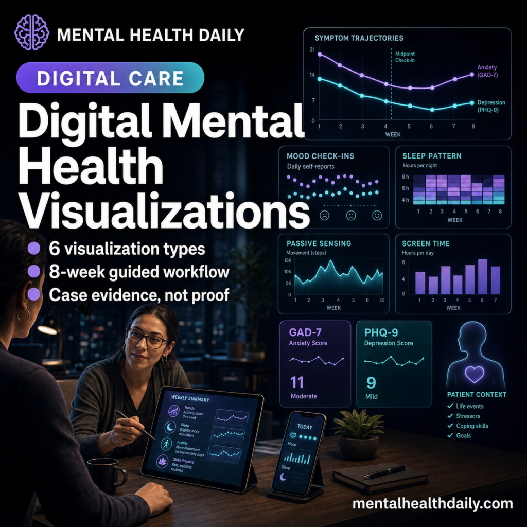
A 2026 participatory-design and case-study paper turned smartphone mental-health data into 6 clinician-facing visualizations for an 8-week anxiety/depression digital clinic, using feedback from 15 clinicians and 3 clinical supervisors. The useful claim is workflow-level: charts made passive sensing and symptom ratings discussable inside care, but the paper did not test whether the visualizations improved clinical outcomes.
Research Highlights
- 6 visualization types were built: Lim et al. described gauge charts, symptom trajectories, correlation matrices, sleep charts, radar charts, and passive-active integration graphs for anxiety/depression care.
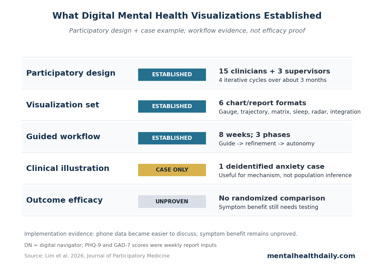
- The design process was clinician-informed: 15 clinicians and 3 clinical supervisors reviewed prototypes across 4 iterative cycles over approximately 3 months.
- The workflow was human-supported: digital navigators met patients weekly for 30-minute sessions and moved through a 3-phase guide, refinement, and autonomy model.
- The case example lasted 8 weeks: visual reports helped 1 anxiety patient connect GAD-7 variability, daily mood ratings, movement, screen time, and self-management patterns.
- 0 efficacy trials were reported: the paper included no randomized comparison, no validated alliance measure, and no patient-satisfaction scale for the visualization workflow.
Digital phenotyping means measuring behavior through data from phones and sensors, such as movement, location regularity, screen time, sleep estimates, and brief self-report surveys. The attraction is obvious: mental-health symptoms change across days and contexts, while clinic visits capture only small slices of that reality.
The hard part is interpretation. Lim et al. noted that smartphones can generate nearly 1 million data points per patient per day when GPS and accelerometer streams are sampled continuously. Raw data at that scale is not care. It becomes care only if someone can decide what a pattern means, when to ignore it, and how to discuss it with the patient without turning therapy into dashboard review.
Six Visualization Types Tried to Turn Phone Data Into Care Conversations
Lim et al. worked inside the Digital Clinic program at Beth Israel Deaconess Medical Center, an 8-week virtual treatment program for adults primarily diagnosed with mild to moderate anxiety or depression. The program combined the mindLAMP smartphone app, weekly clinician sessions, and weekly meetings with a digital navigator — a trained support person who helps patients use technology, interpret data reports, and communicate relevant patterns to the treating clinician.
The visual report used 6 formats, each aimed at a different clinical task:
- Gauge charts: data quality, survey completion, and skills-practice adherence, using quick color cues.
- Symptom trajectory graphs: PHQ-9 depression and GAD-7 anxiety scores over time, with clinical thresholds visible.
- Correlation matrices: links between passive behavior metrics and daily anxiety, depression, or functioning ratings.
- Sleep visualizations: daily sleep duration with contextual markers.
- Radar charts: intake, midpoint, and completion profiles across symptoms and positive domains such as self-efficacy.
- Passive-active integration graphs: behavior metrics and symptom reports aligned on the same timeline.
PHQ-9 is the 9-item Patient Health Questionnaire for depressive symptoms, and GAD-7 is the 7-item Generalized Anxiety Disorder scale for anxiety symptoms. Those scales are familiar to many clinics; the newer piece was showing them beside phone-derived behavior data without making either source look more precise than it really was.
Clinicians Wanted Simpler Labels, Data-Quality Flags, and Context
The design process was small but concrete. Fifteen clinicians and 3 clinical supervisors participated in 4 iterative cycles over approximately 3 months. They reviewed draft visualizations for clinical relevance, interpretability, workflow burden, and data-quality concerns.
Several changes exposed the real implementation problem:
- Data quality needed its own visual language: clinicians wanted low-completeness data separated from meaningful patient patterns, so the team added red and green-blue indicators.
- Technical labels created friction: axis labels were simplified and paired with contextual summaries because early labels were too technical for fast clinical use.
- Thresholds needed plain interpretation: patients asked for clearer separation between normal variability and clinically meaningful change, leading to shaded bands and plain-language annotations.
- Complex plots needed guided review: correlation matrices were difficult for many patients to interpret without help, so the workflow introduced them during navigator sessions rather than as standalone patient materials.
That design history is more important than the software stack. A mental-health dashboard can fail by being too pretty, too dense, too confident, or too detached from the 20-minute reality of clinical appointments. The Lim et al. paper treated visualization as a clinical communication problem rather than an analytics problem alone.
The Digital Navigator Was the Safety Rail, Not a Decoration
Digital navigators met patients separately from clinician-led therapy for weekly 30-minute virtual sessions. Their role was not psychotherapy and not independent clinical decision-making. They explained the reports, helped patients troubleshoot the app, documented patient interpretations, and escalated concerns to clinicians.
The workflow used 3 phases:
- Guide: early sessions taught the patient how each visualization was generated and how to read early patterns.
- Refinement: later sessions compared new reports with prior weeks and tied symptom changes to context such as illness, academic deadlines, sleep, or routine disruption.
- Autonomy: final sessions shifted more interpretation to the patient, who generated hypotheses about behavior-symptom links and self-management changes.
This human layer matters because passive data can be misleading when taken literally. A spike in hometime can mean depression-related withdrawal, illness recovery, exam preparation, remote work, safety concerns, or ordinary weather. A navigator can ask which explanation fits the patient's week before the care team treats the graph as a signal.
The Case Example Supported Insight, Not Generalizable Efficacy
The clinical illustration involved an advanced-degree student in his late 20s referred for anxiety. Weekly graphs showed low, stable PHQ-9 depression scores but more variable GAD-7 anxiety scores. When anxiety rose in week 2 after close friends moved out of state, the visual pattern matched the patient's account and helped tie symptom change to a life event.
Daily ratings added another distinction. Depression ratings fluctuated day to day while weekly PHQ-9 scores stayed stable, helping the patient separate ordinary mood-level variability from sustained depressive worsening. Correlation matrices then helped connect lower step count, greater hometime, screen time, and symptom ratings to concrete routines.
The most interesting engagement signal came later. In week 6, formal skills-practice engagement dropped to 0%, yet weekly report engagement continued and symptoms remained improved. Lim et al. interpreted that as possible internalization of coping strategies: the patient was using skills even when app-based completion no longer captured them.
Evidence-strength note: this was a single deidentified case inside a quality-improvement project. It can show how the workflow might operate and why patients may find guided data review useful, but it cannot show that visualization caused symptom improvement, prevented relapse, improved therapeutic alliance, or outperformed ordinary therapy plus symptom scales.
Workflow Evidence Is Stronger Than Dashboard Claims
Bringmann et al. developed ESMvis, a tool for visualizing individual experience sampling method data, meaning repeated momentary reports of symptoms, context, or behavior in everyday life. That work addressed the same basic bottleneck: individual time-series data can be clinically useful only if the display helps a person and clinician see patterns without requiring statistical expertise.
Myin-Germeys et al. pushed the same issue from an implementation angle. Experience sampling can support person-centered mental-health care, but routine use requires an agenda for workflows, interpretation, burden, and clinical decision-making. Digital mental-health data does not become actionable just because it is high-frequency.
The Digital Clinic evidence is also more cautious than the technology rhetoric. Macrynikola et al. tested the feasibility, acceptability, and potential efficacy of the broader Digital Clinic model, while Chen et al. standardized the digital navigator role. Lim et al. sits on top of that care model: it adds a visualization layer that still needs outcome trials comparing guided visualization against ordinary digital-clinic support.
Privacy, Access, and Bias Decide Who Can Use This Model
The paper included several guardrails. Passive signals were aggregated and deidentified, precise location traces were not stored or displayed to clinicians, identifiable data stayed under institutional control, and patients could request static PDF copies of their weekly reports. Those choices reduce some obvious risks.
They do not remove the harder access questions:
- Device access: smartphone ownership is common but not universal, and phone quality can change passive-sensing accuracy.
- Data willingness: some patients will not want location, sleep, screen, or movement data in their mental-health record.
- Data literacy: patients vary in comfort reading charts, especially correlation matrices or radar plots.
- Clinical capacity: the model requires trained navigators, supervision, documentation, and escalation pathways.
Those constraints are not reasons to dismiss digital phenotyping. They are reasons to avoid treating it as an automatic upgrade. The model is most plausible when the clinic has a human workflow for consent, interpretation, troubleshooting, and patient control over which data streams are used.
Practical Read: Use Visualizations to Ask Better Questions
Lim et al. supports a narrow but useful standard for digital mental-health visualization: the chart should improve a conversation that would otherwise be vague. Did anxiety rise on low-movement days? Did sleep estimates change during exam week? Did PHQ-9 stay stable while daily mood ratings bounced around? Did lower formal app use mean disengagement, or did the patient keep using skills outside the app?
The wrong use is dashboard authority. A correlation matrix should not tell a patient that screen time caused depression. A sleep estimate should not override a patient's account of poor sleep. A red completion gauge should not be treated as moral failure.
The better use is a structured prompt: here is a pattern, here is its data quality, here are 2 plausible explanations, and here is what the patient says happened that week.
Questions About Digital Mental Health Data Visualizations
Did the 2026 Lim paper show that visualizations improve anxiety or depression?
No. It described a participatory-design process and a clinical case example. Symptom improvement in 1 case is not proof that the visualization system caused the improvement.
What was the strongest part of the evidence?
The strongest part was implementation detail: 6 visualization types, 15 clinicians, 3 supervisors, 4 design cycles, an 8-week workflow, and explicit navigator tasks for interpretation and escalation.
Why give patients guided review instead of a dashboard alone?
Complex smartphone data can be misread without context. Lim et al. specifically used digital navigator sessions because correlation matrices, passive sensing, and fluctuating symptom scores require guided interpretation.
What should future trials test?
The next test is comparative: digital-clinic care with guided visualizations vs. the same care without them, measuring symptoms, engagement, therapeutic alliance, privacy comfort, clinician burden, and whether patients keep using self-monitoring skills after treatment.
References
- Lim K, Bodner R, Ledley KT, Wang S, Scheuer LS, Torous J. Integrating Data Visualizations Into Digital Mental Health Care for Adults With Anxiety and Depression: Participatory Design and Case Study. Journal of Participatory Medicine. 2026;18:e90255. https://doi.org/10.2196/90255
- Bringmann LF, van der Veen DC, Wichers M, Riese H, Stulp G. ESMvis: a tool for visualizing individual experience sampling method (ESM) data. Quality of Life Research. 2021;30(11):3179–3188. https://doi.org/10.1007/s11136-020-02701-4
- Myin-Germeys I, Schick A, Ganslandt T, et al. The experience sampling methodology as a digital clinical tool for more person-centered mental health care: an implementation research agenda. Psychological Medicine. 2024;54(11):2785–2793. https://doi.org/10.1017/S0033291724001454
- Macrynikola N, Chen K, Lane E, et al. Testing the feasibility, acceptability, and potential efficacy of an innovative digital mental health care delivery model designed to increase access to care: open trial of the digital clinic. JMIR Mental Health. 2025;12:e65222. https://doi.org/10.2196/65222
- Chen K, Lane E, Burns J, Macrynikola N, Chang S, Torous J. The digital navigator: standardizing human technology support in app-integrated clinical care. Telemedicine and e-Health. 2024;30(7):e1963–e1970. https://doi.org/10.1089/tmj.2024.0023
- Burns J, Chen K, Flathers M, et al. Transforming digital phenotyping raw data into actionable biomarkers, quality metrics, and data visualizations using cortex software package: tutorial. Journal of Medical Internet Research. 2024;26:e58502. https://doi.org/10.2196/58502